Rural Sustainability Heatmap
Rural Provider Sustainability Jump to the Heatmap View Heatmap User Guide View a Narrative Version of This Page and the Heatmap
Background
The Department of Health Care Policy and Financing (HCPF) conducted an environmental scan of services within Colorado’s Medicaid program, Health First Colorado, through the creation of a dynamic heat mapping tool. The goal of the heatmap tool is to help HCPF identify areas with limited or inadequate access to certain home and community-based services (HCBS) (referred to as Care Deserts) and highlight geographic areas and populations that may be disproportionately impacted by workforce issues, such as a limited number of health care workers.
For purposes of this heatmap tool, access to care is measured based on a member-to-provider ratio. This approach gives more weight to regions with more members. For example, suppose Region A has 500 members and 1 provider, while Region B has 1 member and 1 provider. Although both regions have the same number of providers, Region A will be identified as more problematic than Region B because of the high member-to-provider ratio. The prioritization of more populated areas will allow HCPF to concentrate intervention efforts on areas where more members can benefit from improved access to care.
Rural Provider Sustainability
In 2021, HCPF began working on several initiatives, made possible through funding from the American Rescue Plan Act (ARPA), to help strengthen the workforce and enhance the sustainability of Colorado’s rural providers. ARPA 1.10 Rural Sustainability and Investment Project focused on two key strategies: identifying care gaps with a heat mapping tool and developing shared systems in rural areas.
The goal was to enhance Medicaid and HCBS infrastructure, provider sustainability, and member access. This project laid the groundwork with research, and HCPF aims to continue exploring and engaging stakeholders to implement actionable ideas.
View Rural Provider Sustainability Report - October 2024
- This report provides a brief overview of the work completed through ARPA Project 1.10 and will be used to identify steps forward.
- Presentation - November 2024
Rural Provider Sustainability Community of Practice
Join us for the Rural Provider Sustainability Community of Practice! This meeting was created out of information received during the Rural HCBS Provider Sustainability Listening sessions that occurred in the Spring of 2025, and it is our goal to use this space to connect rural providers, share resources, and offer connection and support for the barriers you experience when connecting members to HCBS services in your communities.
This meeting will occur quarterly on the second Monday of the month. For more information on the Rural Sustainability Project or these meetings, email HCPF_RuralSustainability@state.co.us
Next Meeting:
Monday, March 9, 2026 from 1:00 to 2:30 p.m.
Join via Google Meet
Join via Phone: Toll Free 1-321-586-0975 PIN: 227 662 884#
Future dates:
June 8, 2026
September 14, 2026
December 14, 2026
Meeting Materials
- March 9, 2026
- December 8, 2025
- September 8, 2025
View this meeting information and others on our OCL Stakeholder Engagement Calendar
User Inputs
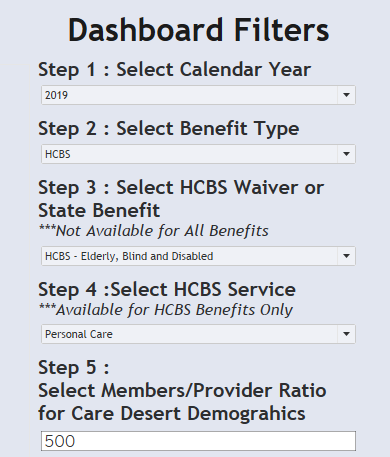
Heatmap results depend on five user inputs: Calendar Year, Benefit Type, Waiver or State Benefit, HCBS Service, and Member/Provider Ratio for Care Desert Demographics.
Step 1: Select Calendar Year
Step 2: Select Benefit Type
The heatmap includes data on the following Benefit Types: Dental, Emergency Department, FQHC, RHC, and IHS, General Hospital-Outpatient, HCBS, Home-Health, Hospice, and PDN, Imaging, Inpatient, Intermediate Care Facility, Pharmacy, Professional Services, and Transportation. Note: each selection filters following steps with only related options.
Step 3: Select HCBS Waiver or State Benefit
The heatmap includes data on Colorado HCBS waivers for adults and children.
- The adult waivers shown in the heatmap include Brain Injury (HCBS BI), Community Mental Health Supports (HCBS CMHS), Developmental Disabilities (HCBS DD), Supported Living Services (HCBS SLS), and Complementary and Integrative Health (HCBS CIH) (formerly the Spinal Cord Injury (SCI) waiver). We also include the Colorado Choice Transitions (HCBS CCT) program, which is not a traditional waiver but a benefit available in each adult waiver.
- The children’s waivers shown in the heatmap include Children’s Home and Community Based Services (HCBS CHCBS), Children’s Extensive Support (HCBS CES), Children’s Habilitation Residential Program (HCBS CHRP), and the Children with Life-Limiting Illness (HCBS CLLI).
Step 4: Select HCBS Service
Note: only available for HCBS Benefits, as selected in Step 2.
Step 5: Select Members/ Provider Ratio for Care Desert Demographics
This is a user input to determine whether a region is considered a care desert. The care desert threshold is subjective and likely depends on the other selections above. As an example, 500 members per provider may be an appropriate benchmark for professional-type services; while hospitals tend to have a much higher member-to-provider ratio since members do not consistently receive hospital-based services. Note: this user input does not impact the color-shading shown on the heatmap. This input is used only within the demographic charts shown below the heatmap.
Understanding Heatmap Tool Results
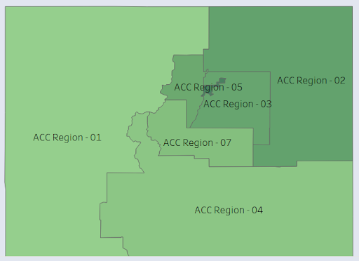
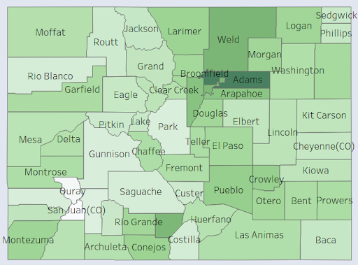
The color-shading on the heatmap is based on a member-to-provider ratio within each Accountable Care Collaborative (ACC) region (left map) or county (right map). Lower member-to-provider ratios are favorable, as they suggest there may be enough providers to serve members within that region. Light green shading represents greater access to care (high provider density or lower member-to-provider ratios) and the darker green shading represents a care desert (lower provider density or higher member-to-provider ratios). White shading indicates that results cannot be shared because there is too little data and sharing them would not comply with Health Insurance Portability and Accountability Act (HIPAA) Safe Harbor requirements.
Percentage of Members Living in a Care Desert by Race
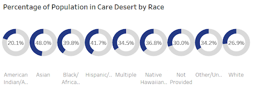
The heat map contains several demographic charts, such as “Percentage of Members Living in a Care Desert by Race,” shown below. These charts will dynamically update depending on the ratio selected in Step 5. In the example below, 48% of the Asian population lives in a care desert. These results highlight that race may be an insightful demographic to help identify persons disproportionately impacted by access to care issues. Comparable charts exist for waiver enrollment, as well.

Contact Us
Direct Care Workforce Unit
HCPF_RuralSustainability@state.co.us


